Forums › Community & News › Community News & The Future › Tuning and improvements
- This topic has 37 replies, 5 voices, and was last updated 8 months, 1 week ago by
 Since1980_v2.
-
AuthorPosts
-
-
29th August 2024 at 1:26 pm #18685
AT&T is blocking the videos on this site in the United States.
-
29th August 2024 at 1:56 pm #18686
Do you mean the embedded Vimeo videos? Or just the ones hosted on this server?
-
-
29th August 2024 at 3:11 pm #18691
Also, those of you on mobile devices, do you like the optimisations I’ve made to the header area (the panel directly below the menu)? Is it easier/clearer?
-
29th August 2024 at 10:22 pm #18702
Just made more tweaks and (hopefully) improvements. Also updated the Master Dare List too.
Diana likes this
-
30th August 2024 at 2:07 pm #18706
Should I attempt to reduce the size of the main menu (at the top of the site) again?
-
31st August 2024 at 9:10 pm #18707
I could probably get rid of the top menu altogether.
-
1st September 2024 at 12:09 am #18708
Ed: “I could probably get rid of the top menu altogether”
I did wonder about that myself.
I normally visit the site on desktop, where it makes reasonable sense in its current form. But when you mentioned tuning it for mobile view I sent the home page to my phone.
In mobile view, a third of the screen is taken up with the header and top menu, another third is taken up with the orange panel and the bottom third is taken up by “welcome to our community site”. Only after scrolling down do you get to any actual content. It takes a lot of scrolling to get to any actual content. But initially, that mobile user sees very little of what I see at first glance on a desktop screen. So, that “top left corner” of the desktop screen needs to contain something very compelling when it appears on its own to encourage people to scroll down further.
Perhaps the home page needs a completely different layout to the rest of the site. A landing page dominated by a photo and story that changes every day from a list of top articles. So the site looks different at every visit, even if, at first, nobody is contributing anything new.
Is there a mechanism that could automatically embed a random blog or forum post on the home page?
-
1st September 2024 at 4:50 pm #18709
In mobile view, a third of the screen is taken up with the header and top menu, another third is taken up with the orange panel and the bottom third is taken up by “welcome to our community site”. Only after scrolling down do you get to any actual content. It takes a lot of scrolling to get to any actual content. But initially, that mobile user sees very little of what I see at first glance on a desktop screen. So, that “top left corner” of the desktop screen needs to contain something very compelling when it appears on its own to encourage people to scroll down further.
I’ve tried to fix that by removing the righthand top menu panel (it was to the right of the Updates panel, and appeared below it on mobile devices). Removing the menu would help further.
Perhaps the home page needs a completely different layout to the rest of the site. A landing page dominated by a photo and story that changes every day from a list of top articles. So the site looks different at every visit, even if, at first, nobody is contributing anything new.
The “Welcome” post absolutely must be the first post you see on the main page. If I don’t describe the content and display an age warning, I’ll get in trouble (with my hosting company for starters).
Is there a mechanism that could automatically embed a random blog or forum post on the home page?
Not that I know of. There may be a plugin that does that but I’m attempting to remove around 1/3 of the plugins as I’ve got way too many.
-
-
-
1st September 2024 at 5:08 pm #18711
-
2nd September 2024 at 9:26 pm #18744
Can anyone remember why I got rid of it years ago? I vaguely remember a spam problem, but I’m not sure.
-
3rd September 2024 at 10:27 am #18751
When was it removed?
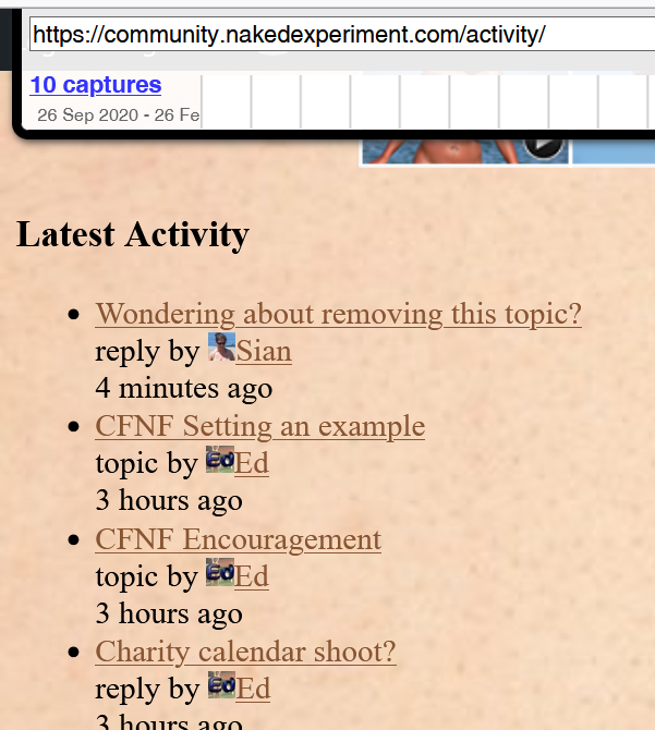
I looked in archive.org, which has pages going back to 2018, but I didn’t find anything that resembles the format that I see at https://community.nakedexperiment.com/activity/
-
3rd September 2024 at 10:38 am #18753
I can’t find it in the logs. I would imagine the same time I removed the groups and the old forum, but I don’t remember when that was.
-
4th September 2024 at 2:45 pm #18763
I guess this was the discussion that led to its removal:

That was seen on 27 July 2021. Sadly, archive.org does not seem to have captured the actual discussion.
It had gone by the next capture, on 04 Dec 2021
Attachments:
You must be logged in to view attached files. -
4th September 2024 at 10:30 pm #18766
I’m not sure. “Topic” implies something in the forum.
Has anyone seen Sian around here recently? I haven’t seen her in ages.
-
4th September 2024 at 11:52 pm #18770
-
5th September 2024 at 9:16 am #18773
Sorry, I didn’t mean on the site (I should have been clearer). I meant has anyone seen online (on other websites etc.) or messaging etc.
If anyone has, I was going to suggest reminding her about our site. I know a few people who stopped visiting for a while and then forgot about the community. When something reminded them they returned to being active again.
Diana likes this
-
-
-
4th September 2024 at 12:35 am #18761
I see you’ve changed https://community.nakedexperiment.com/activity/ so that it displays only a few lines and then “read more”.
That seems like an improvement to me … the full posts were showing yesterday.
I guess its purpose would be to spotlight such activity as there is, increasing its visibility to encourage further participation. For that, seeing many initial snippets is probably better than seeing just one or two long posts.
Diana likes this
-
4th September 2024 at 8:30 am #18762
Weirdly, I didn’t change that as it has no admin options. I wish I could control which events appear within it.
Diana likes this
-
4th September 2024 at 5:02 pm #18765
I think anyway that if https://community.nakedexperiment.com/activity/ appears somewhere that’s easily seen when visitors return to the site, it stands a chance of increasing participation.
Diana likes this
-
4th September 2024 at 10:32 pm #18767
-
-
-
6th September 2024 at 9:39 pm #18784
Does the main menu make it easier for new visitors?
-
7th September 2024 at 10:45 pm #18803
Ed: Does the main menu make it easier for new visitors?
First or second visit, maybe. I know if I visit a site that looks interesting at first glance, I will either check out most of the main menu items or come back later to find out what I might have missed.
Ed likes this
-
-
11th September 2024 at 12:56 pm #18884
Better?
-
12th September 2024 at 9:24 am #18886
-
13th September 2024 at 8:34 am #18887
-
13th September 2024 at 1:19 pm #18888
-
-
15th September 2024 at 2:37 pm #18896
-
15th September 2024 at 5:56 pm #18897
That’s true. Actually, it’s been a recurring thing that people get attached to a concept but don’t actually use it in reality.
In that case, it was pointed out to me that the ladies had some ability to chat with each other in private via the private messaging feature.
Diana likes this
-
-
9th November 2024 at 1:08 pm #19532
Is it just me, I think my eyes are ok but worth checking.
The shading behind the words on the links at the top (at least on mobile) makes the links look blurry and almost unreadable at certain angles.
-
9th November 2024 at 9:19 pm #19535
They are very dark brown on the background fleshtone. It could be the shadow? But I have no control over that. Like all sites, this site is terrible on a mobile. I find it totally unusable.
-
-
4th December 2024 at 12:13 am #19669
Is there anyway to introduce an experiences/stoies area. Specifically one with a way to save drafts as well.
Some way for people to share experiences from the planning of them, their emotions leading up to an event. The event itself and then the feelings after.it would be good to have a section somewhere that allows us to update the story as we go then publish. Would also be good to be able to publish in segments as stuff happens then complete the story over time.
i keep saying story but i mean real events not just fantasies or anything else. I keep feeling like the forums are not really the right place for sharing experiences and it would be cool to have a dedicated place to share these things
-
4th December 2024 at 8:02 pm #19670
Not that I know of, but for longer posts I would always recommend writing them in Notepad or similar (which saves as you type) and copy & paste into the forum here (either in sections or the whole thing).
I already have more than 30 plugins adding functionality and the recommended maximum in 15-20.
-
4th December 2024 at 10:43 pm #19671
I downloaded Wattpad app. I’m up to about 2000 words so far tonight. I need to put more in to feelings and things around specific parts of the story but as that story has some upcoming parts of it I have also started story no2 for an experience that will be taking place sooner.
My favourite part of other peoples experiments/experiences is not seeing the evidence in photo form but getting into their head and finding out what they were thinking. Writing it down and how felt is kind of like being exposed again but I think it’s far more interesting to read how someone felt than see the the evidence..don’t get me wrong share the photos I’ll look at them and admire you confidence but give me the build up, the emotions during and after . Do you feel more or less inclined to go further with your next challnege. That’s what I love reading about.
-
-
-
23rd September 2024 at 12:42 pm #18917
The activity stream is the original, built-in, way of listing notifications. The Notifications panel is an add-on.
The activity stream is a little vulnerable to spam and, when the site was busy, lots of posts got lost in the huge number of update notifications. It lacks filter controls to choose what updates qualify to get included in the list.
-
-
AuthorPosts
- You must be logged in to reply to this topic.


